














Apple Paper Bag Design: Paper Handles and an Uninterrupted Front
A close look at Apple's textured paper handles, uninterrupted front panel and lower folding arrangement, with practical lessons for a brand's own paper bag design.
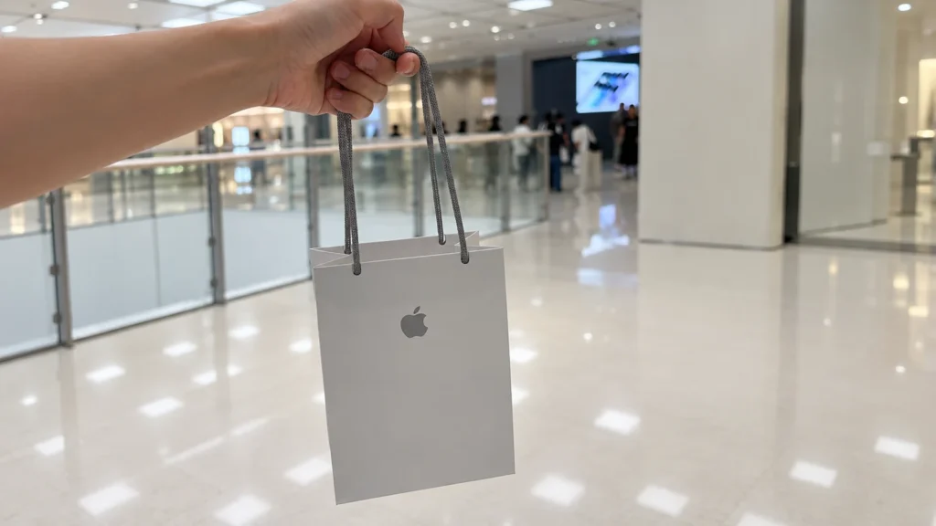
Apple's paper bag is a useful reference for brands that want a quiet, carefully considered retail presentation. Two details do much of the work: textured paper handles and a folding arrangement that keeps a prominent horizontal storage crease off the main front face. Together, they give the pale paper and small gray logo room to stand out.
The examples shown here are worth looking at from several angles. The front explains the visual effect; the handles, top edge and folded side reveal some of the construction behind it. For your own packaging, the useful starting point is to decide which of those qualities matters most to the customer carrying the bag.
Paper handles with a textile-like texture
At first glance, the gray handles can look like fabric cord. Up close, their repeating knitted structure is much more distinctive than a conventional twisted paper handle. The texture adds detail to an otherwise restrained bag, while the gray tone connects the handles visually with the printed Apple logo.
The underside marking on the supplied example identifies the knitted handles as paper. There is also a technical reference for this approach: Apple's paper-bag patent describes paper-fiber yarn knitted in a circular pattern. That helps explain how paper can take on this tubular, textile-like form. The patent describes a design and its possible constructions; it is not a specification sheet for every Apple bag in circulation.
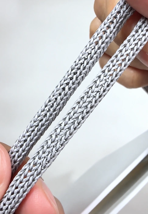
This is an effective example of a handle contributing to the design beyond its basic carrying role. Its pattern remains visible against the plain surface, and its long loops give the bag a different silhouette from a short-handle shopping bag. The close-up shows the structure clearly, although comfort and carrying performance would need to be assessed with a physical bag and its intended contents.
For another brand, the broader lesson is to consider handle texture, color and proportion together. A handle can echo a logo color, introduce a subtle surface contrast or change how the bag hangs from the hand. Those decisions deserve attention early in the design.
The top edge is part of the overall finish
The handle connection is another detail that becomes apparent at close range. In the photograph below, the gray cord meets a folded paper rim, with the inner paper surface visible behind it. The transition is visually compact, keeping attention on the cord and the clean upper edge.
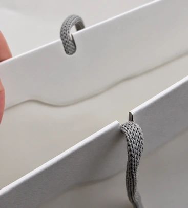
A minimal bag gives these small junctions more visual importance. The height of the folded top, the position of the handle entry and the way the cord rests against the edge all affect the finished appearance. The photograph shows that relationship, but it does not reveal the complete hidden attachment or reinforcement construction.
When developing a different design, compare the top edge and handle as one detail. A well-chosen cord can still look awkward if its scale or entry position does not suit the bag's proportions. PAQIVA's handle and attachment overview provides broader context for those design decisions.
Why the front has no obvious horizontal “waistline”
Many shopping bags acquire a horizontal fold across their broad faces when flattened for storage. On a plain bag, that line can become a noticeable part of the design: it catches light, crosses the print area and divides the face into sections.
In the Apple examples shown here, there is no prominent crosswise storage crease running through the main front panel. The result is a continuous field of pale paper around the logo. That uninterrupted space is especially effective with a small central mark and very little additional printing.
The bag still has folds. Its side gussets and bottom must change shape as it opens and closes, and ordinary handling can leave surface wrinkles. The distinction is where the main flattening folds sit, and how strongly they interrupt the broad face.
The narrow side view below helps make that distinction visible. Paper layers gather around the folded lower section while the tall face remains largely uninterrupted. A front photograph alone would miss this part of the design.
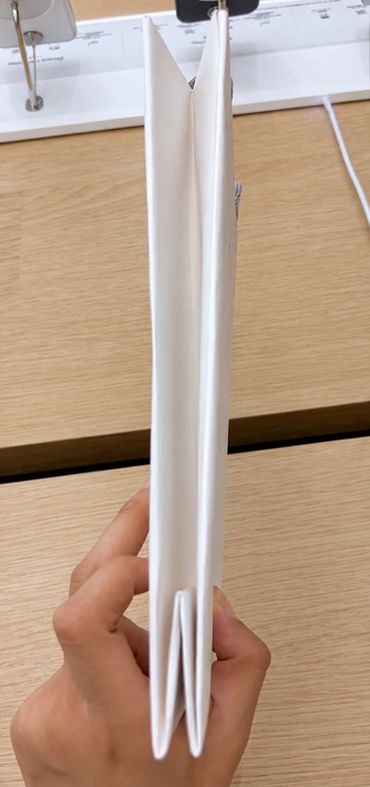
For a custom bag, fold placement belongs in the structural discussion before artwork is finalized. Consider the bag open, flattened and being carried. A layout that looks balanced on a flat artwork file may read differently when a storage crease crosses the logo or a large area of solid color.
What the paper tells us—and what remains unconfirmed
The paper contributes as much to the impression as the print. In these photographs, it has a pale, softly textured appearance with restrained reflection. Changes in lighting make it look warmer, cooler or grayer, so the images should not be treated as an exact paper-color reference.
The underside marking on the supplied example states that the shopping bag is made from 100% recycled paper. That is a material claim printed on this particular sample. It does not establish the recycled content of every Apple bag from every year or market, and it should not be expanded into a claim of 100% post-consumer content.
The precise surface treatment of the photographed stock has not been established. Its appearance alone does not identify a coating, a finishing process or a paper grade. What can be appreciated directly is how the surface, gray print and textured handles work together without competing for attention.
For a new brand's bag, specify the desired paper appearance and feel separately from recycled-content requirements. PAQIVA's paper options guide is a starting point for comparing paper choices; the final stock needs to suit the print and construction of the actual project.
A simple appearance can involve specialized production
This bag's restrained appearance is supported by several coordinated choices: a distinctive handle structure, a carefully arranged fold pattern and a paper surface that suits the overall design. Each affects more than what appears on the front artwork.
Specialized handles and folding constructions generally involve higher minimum production commitments than standard alternatives. Component batches, paper availability and converting setup all influence the practical order quantity. There is no single MOQ that can responsibly be assigned to an “Apple-style” bag from photographs, and no specific Apple purchasing quantity is established here.
The useful design lessons are straightforward:
- Give the handle a deliberate role in the bag's color, texture and proportions.
- Check where the structure places folds when the bag is opened and flattened.
- Choose paper for its appearance and behavior as well as its stated material content.
For your own custom paper bag project, share the product dimensions, intended order quantity and visual priorities with PAQIVA. A clear brief built around your brand's needs makes the discussion about paper, handles and structure more productive.