













Foil Stamping vs Embossing vs Spot UV for Paper Bag Logos
Choose the logo effect that fits your paper bag: metallic reflection, subtle paper relief or localized gloss. Compare standalone and combined finishes, paper compatibility and quotation drivers.
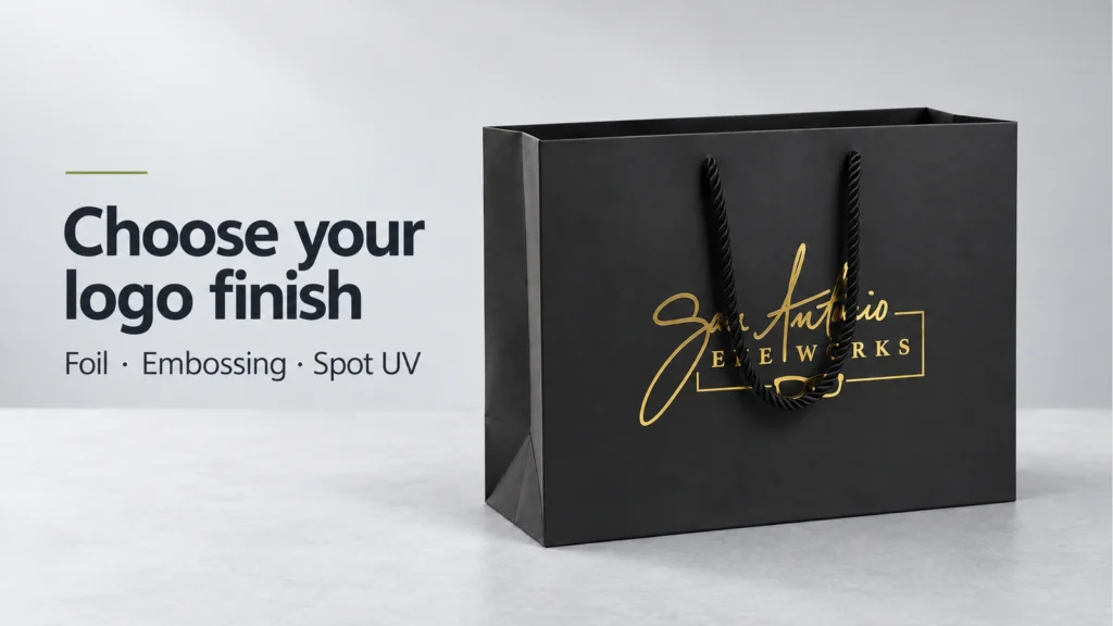
Choose hot foil stamping when the logo needs metallic colour and changing reflections. Choose blind embossing when the paper's raised shape and tactile detail should carry the design. Choose gloss spot UV when you want selected areas to catch the light against the surrounding surface. For a raised metallic logo, specify foil plus embossing as a separate combination.
These finishes create different visual and tactile results. A quiet white-on-white mark may suit one brand; a flat silver logo or glossy tonal pattern may suit another. Decide what customers should notice first, then compare that effect on the intended paper bag.
Three standalone finishes at a glance
| Finish | Visual effect | What you feel | Paper and surface considerations | Main quotation drivers |
|---|---|---|---|---|
| Hot foil stamping, without embossing | Metallic reflection when a metallic foil is selected | Usually a relatively flat finish; slight impression may occur | Match the foil grade to the paper, ink and coating or film | Tooling, foil selection, coverage, positions and quantity |
| Blind embossing | Raised paper, revealed by light and shadow; no added foil or ink | A raised logo formed in the paper | Test the paper's response to the intended relief and inspect the reverse | Tooling, relief complexity, paper and quantity |
| Standard gloss spot UV | Clear gloss over selected areas; often strongest against a matt background | A coating layer; pronounced height is not guaranteed | Test coating adhesion, surface absorption and gloss contrast | Application method, coverage, positions and quantity |
Compare the same logo fairly
Keep the logo artwork, finished size, position and coverage identical. Start with the same paper and base finish wherever the proposed processes allow it. If a supplier needs to change the stock or lamination, record that change: you are then comparing complete constructions as well as logo treatments.
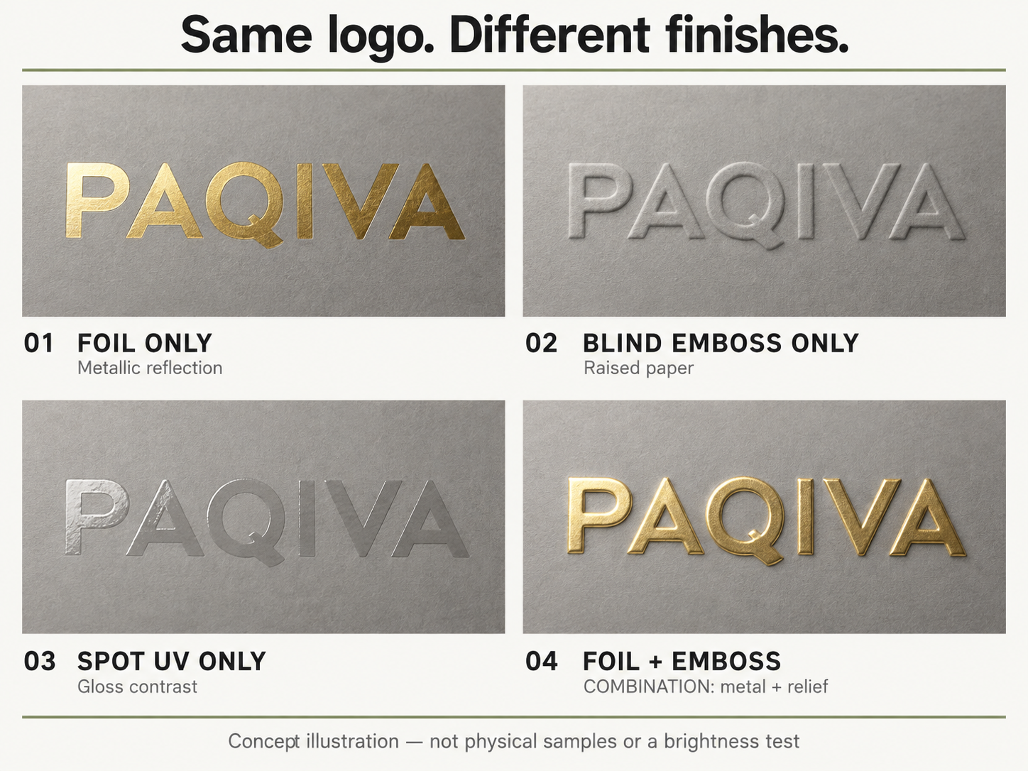
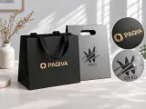
The comparison above uses the same PAQIVA demonstration wordmark in an AI-generated concept illustration, not a physical sample test. Its fourth panel shows foil plus embossing, a combination of two effects. Use it to discuss design direction; approve colour, reflection, relief and touch from physical samples.
For a real comparison, view the samples together under the same light, then tilt each one. Compare them straight on and at an angle. A single photograph cannot reliably establish which finish is brighter or how it feels.
Hot foil stamping: choose the reflection and the actual foil shade
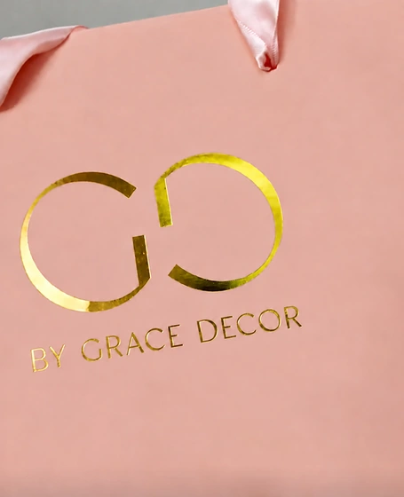
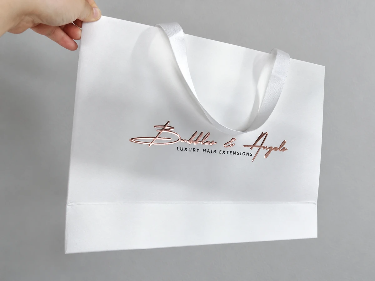
With a metallic foil, rotating the bag changes the reflection. A highlight can appear strong at one angle and quieter at another. On the pink bag below, the broad gold monogram and fine lettering show how the same finish works across different parts of a logo.
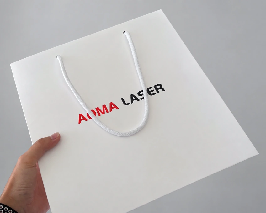
Foil is not limited to gold and silver. The white bag below uses red and black foil treatments for a two-colour logo. These are colour choices within a foil design; the exact shade and surface finish should be selected from the supplier's physical swatches.
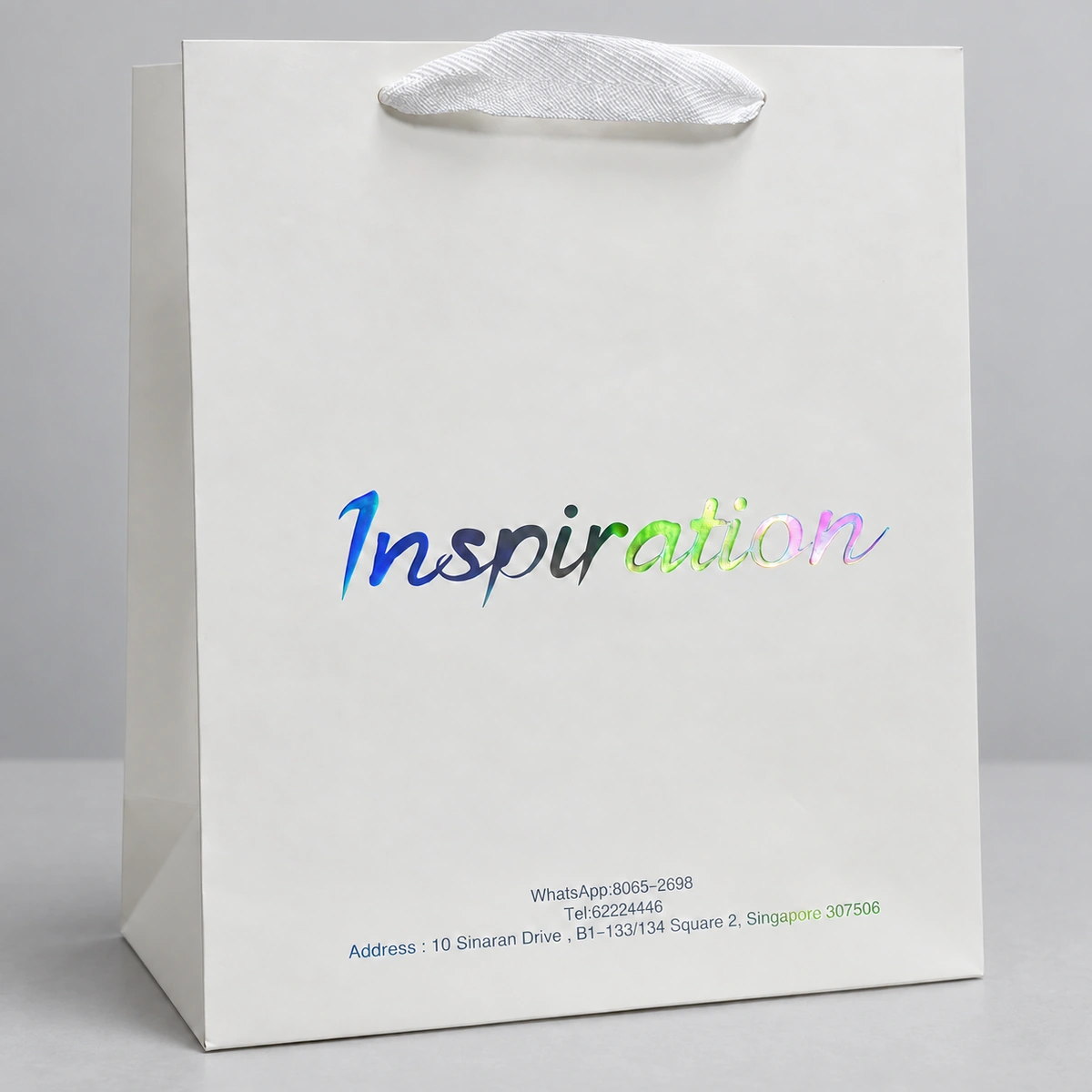
Holographic foil gives another visual direction. In this white-bag example, blue, green and pink reflections appear across the script wordmark. View the actual sample at different angles before choosing this effect for your artwork.
For gold tones, compare pale gold with a richer yellow gold beside the intended paper colour. Names such as “champagne,” “yellow gold” and “black gold” are not universal colour standards. Confirm the supplier's foil reference and whether it is metallic, pigmented, glossy, matt or holographic; a black foil is not automatically metallic black.
A slight pressure impression may be visible on some foil samples, but it is not a required feature. If you want the logo deliberately raised or recessed, specify embossing or debossing separately.
Blind embossing: let the paper form the logo
Embossing raises the paper into a shaped image. Blind embossing uses that relief without adding foil or printed colour to the mark; debossing creates a recessed impression. The distinction matters when specifying an otherwise simple white or tonal logo. See the FSEA designer's guide to foil stamping and embossing.
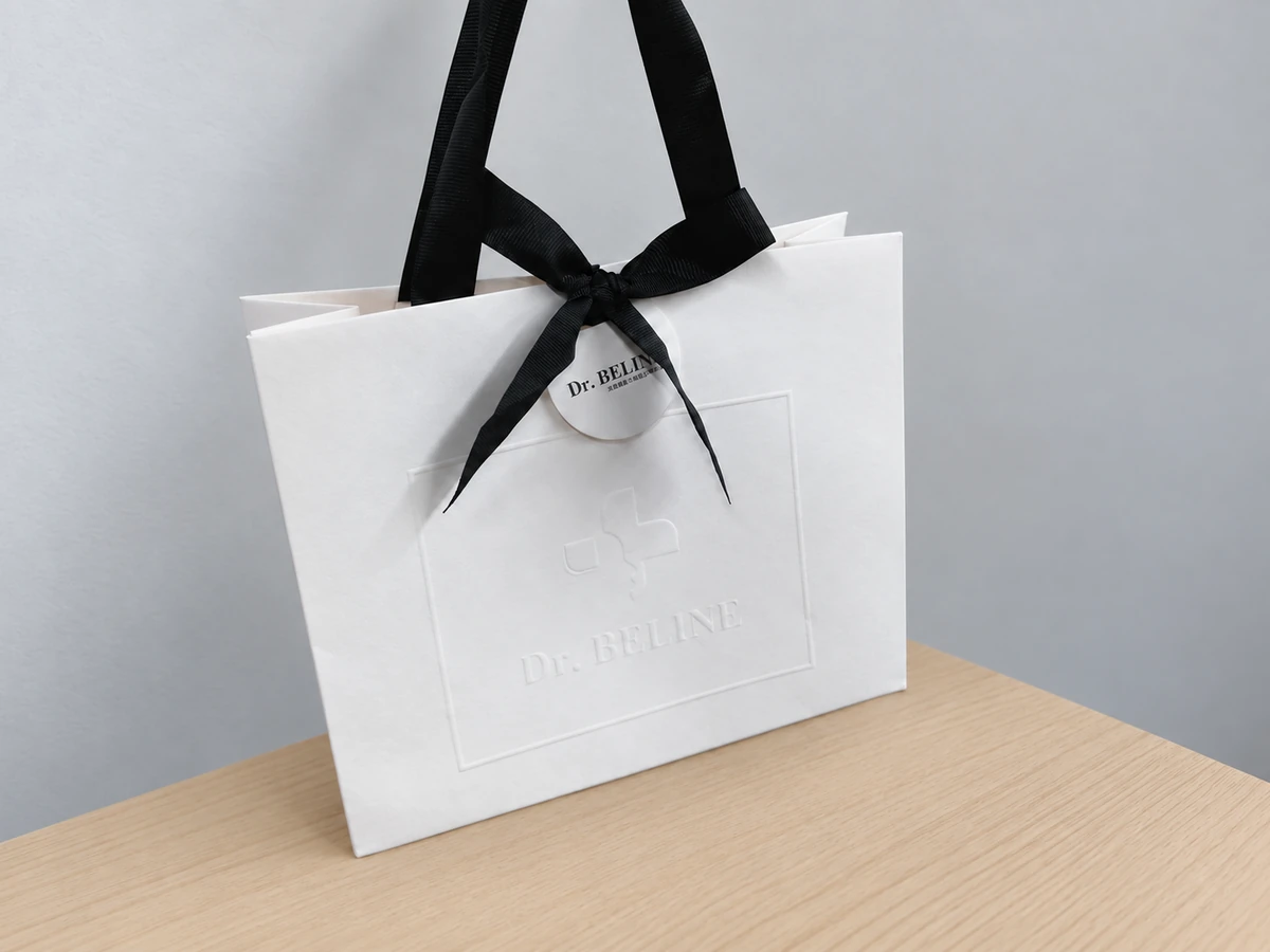
Blind embossing is a useful direction when you want customers to discover the logo through touch and shadow. Consider how much visibility you need at normal viewing distance: an uncoloured mark can look restrained on a desk yet become difficult to read under flat lighting.
Give the supplier the logo at its final size, including small lettering and narrow spaces. Ask for a sample that shows whether those details remain distinct, how the relief looks on the reverse and whether the paper stays intact around the edges. More depth is not automatically a better result; the relief must suit the artwork and stock.
Spot UV: separate gloss from raised texture
For the glossy effect discussed here, spot UV means a clear coating or varnish applied to selected areas and cured with ultraviolet light. UV-curable printing inks also exist, but “special ink” is an imprecise description of this clear finishing layer. ACTEGA's UV coating information explains ultraviolet curing and shows that UV coatings can produce several surface effects.
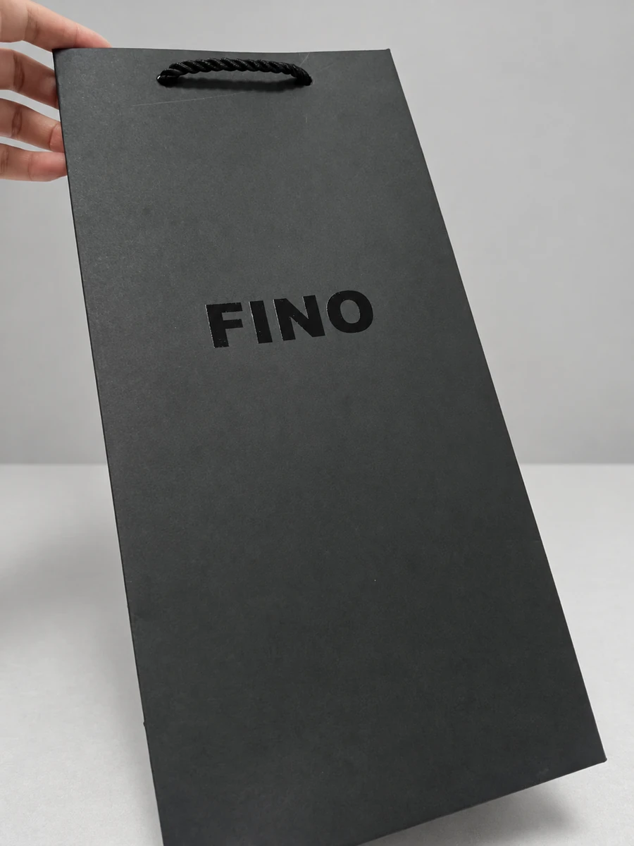
Standard gloss spot UV is primarily a way to control where the surface reflects light. It can follow a printed logo or create a tonal gloss pattern. Against a matt background, the difference may become especially apparent when the bag is tilted.
If you want a distinctly raised, tactile logo, request raised or high-build UV explicitly. Do not assume a quotation for standard spot UV includes that height. Equipment suppliers distinguish conventional flat spot varnishing from raised effects; Konica Minolta's JETvarnish information provides one example of that distinction, rather than a specification for every UV process.
Spot UV is not inherently brighter than foil, nor does it guarantee finer detail. Foil reflection and clear-coat gloss behave differently. Small text, fine lines and tight gaps need approval at actual size for whichever process you choose. Ask to see edge definition and registration, especially where the clear layer must follow an underlying printed logo.
Foil plus embossing: quote the combination separately
Foil plus embossing combines a decorative foil layer with a raised paper shape. It is the appropriate request when you want a metallic logo that also stands above the surrounding paper. It should appear as its own option beside flat foil, blind embossing and standard spot UV.
The process may use a combined tool or separate, registered foil and embossing operations. A combination does not necessarily mean two production passes: specialist die maker OWOSSO confirms that a combination die can foil and emboss in one pass.
Specify which elements receive foil and which are raised. A raised symbol with flat foil lettering is a different brief from raising the entire wordmark. Discuss the additional relief and alignment requirements before treating a combination as an upgrade to the approved flat design.
The product photographs in this article are separate design examples, not a controlled comparison of identical samples. They do not establish relative brightness or imply a customer relationship with PAQIVA.
Match the finish to the paper, printing and lamination
Describe the full surface construction when requesting a sample: paper grade and colour, printed areas, coating or lamination, then the proposed logo treatment. “White paper with gold” omits details that can change the result.
Textured paper is not automatically unsuitable for foil. Different foil grades address different substrates and surface conditions, as illustrated by KURZ's metallic hot stamping range. On your chosen stock, inspect the logo for incomplete coverage, broken fine lines and loss of detail. Confirm compatibility with the particular film or coating instead of assuming that all matt laminates behave alike.
For embossing, inspect the relief, edge integrity and reverse of the sheet, then review the formed bag. Keep the intended logo position clear in the artwork so its relationship to folds and construction is assessed.
For spot UV, a compatible smooth coated or laminated surface is a useful starting point for crisp gloss contrast. Absorbent uncoated paper can reduce that effect; it may need a coating system or preparation suited to the stock. This is a compatibility question, not a blanket ban on kraft or textured paper. If the paper or lamination changes during development, approve the finish again on that construction.
What changes the quotation?
Request separate prices for flat foil, blind embossing and standard gloss spot UV using the same bag specification and order quantity. Add foil plus embossing or raised UV as clearly named alternatives. There is no reliable universal price order based only on those process names.
Ask the quotation to distinguish:
- Initial setup: dies, plates or other preparation, with any sample charges identified.
- Production scope: logo size and coverage, foil colours, treatment on one or both faces, and any additional positions.
- Detail and alignment: fine artwork, relief complexity and registration between treatments.
- Order quantity: the unit price at the quantities you are actually considering.
- Repeat orders: which tools can be reused and what changes would require new preparation.
Ask whether a proposed material change is required for production or offered as a design alternative. That makes it easier to understand whether the price difference comes from the finish, the paper or both. Any additional sampling or scheduling requirements should also be stated before approval.
Approve the sample against a practical checklist
- Colour and visibility: view the logo under ordinary room light and a directional light. Tilt it and compare the foil to the selected swatch.
- Touch: feel the paper relief or coating. Verify that standard spot UV, raised UV and embossing match the effect actually ordered.
- Detail: inspect small letters, fine lines, enclosed spaces and foil or coating edges at the final logo size.
- Alignment and surface condition: check registration, gaps, pinholes, unwanted impressions and damage around raised areas.
- Finished-bag behaviour: examine the reverse, folds and nearby construction. Agree a handling or rub check appropriate to the intended use.
Record the approved paper, surface finish, artwork size, foil reference and treatment combination together. A physical finish sample helps only when the production specification identifies what was approved.
To compare options for your paper bag, send PAQIVA an enquiry with the bag dimensions, quantity, intended paper or reference sample, logo artwork and desired logo size and position. State whether the priority is metallic reflection, subtle paper relief, gloss contrast or a raised metallic effect. This gives the quotation a clear starting point and keeps standalone and combined finishes easy to compare.