















Jewelry Paper Bag Styles: 6 Handle Designs, Foil and Texture
Compare six jewelry paper bag styles and see how handles, gold foil and textured paper shape the presentation. Plan the final bag around your jewelry box and counter-packing routine.

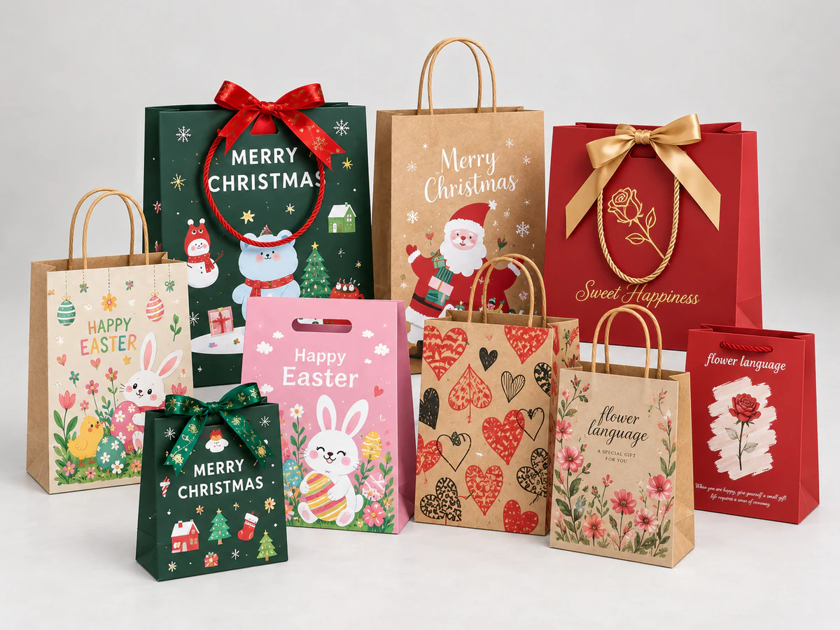
For a jewelry paper bag, start with the boxed purchase and the way you want to present it. Cord handles with a ribbon bow create a gift-ready look; glued-in ribbon keeps the top edge visually clean; a die-cut handle gives the bag a compact, distinctive silhouette. Threaded ribbon, cord and riveted handles offer three further ways to express the brand.
The difference is often in the details: the width of a ribbon, the space around a small logo, or the contrast between gold decoration and textured paper. These six styles show how those choices come together.
The photographs are supplied design examples. Brand marks illustrate the designs shown and do not imply a customer relationship with PAQIVA.
1. Cord handles with a ribbon bow: a gift-ready combination
This style combines two separate elements: cord handles for carrying and a ribbon bow for decoration. Coordinating the cord, ribbon and lettering creates a cohesive palette, so the bow feels part of the bag rather than an afterthought.
It is a useful direction for engagement gifts, anniversaries and other purchases where the handover should feel personal. A bow near the opening draws the eye upward; leaving space between it and the logo keeps the front readable.
Decide whether staff will tie the bow at the counter or whether the decorative ribbon will arrive prepared. That choice affects the daily packing routine. If you also want a ribbon closure, specify it separately: the presence of a bow alone does not establish how the bag closes.
2. Glued-in ribbon handles: a clean top edge
With glued-in ribbon handles, the attachment is concealed inside the bag's upper construction. The ribbon appears to emerge over the top edge, leaving the outer face free of handle holes.
The burgundy example pairs matching handles with a restrained gold-colored wordmark. Its broad, quiet front makes the paper color and logo the main features. This direction suits a brand that wants a polished retail bag without a decorative bow.
Pay attention to how the ribbon rests when the bag is set on a counter. A low-hanging loop can cross the logo, while a different handle length or logo position changes that relationship. The attachment method and ribbon finish are separate choices; glued-in does not automatically mean satin.

3. Die-cut handles: a distinctive, compact shape
A die-cut handle is an opening within the bag itself. Without a separate loop above the top edge, the outline feels compact and graphic. The cream bags shown here use a rounded opening above a large circular logo, making the handle part of the overall composition.
This can be a fresh alternative for a jewelry brand with a bold symbol or a minimal visual identity. A short, uncluttered front lets the cutout and logo establish the character of the bag.
Plan the boxed contents below the grip area. A bag may look tall enough from the outside while the box interferes with the customer's fingers inside the opening. The shape of the cutout and the surrounding paper construction need to work together for comfortable carrying.

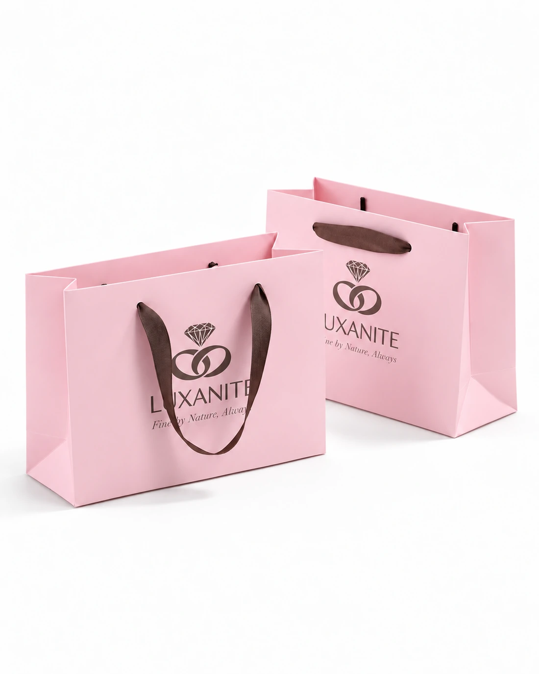
4. Threaded ribbon handles: visible softness and color
Threaded ribbon passes through openings in the bag wall and is secured inside. Those attachment points become part of the design. Ribbon width and color can make a small bag look delicate, restrained or more expressive.
The pink example uses brown ribbon and dark lettering for contrast. A tonal ribbon would produce a quieter effect; a wider ribbon would place more visual emphasis on the handle. Neither change requires a more complicated logo.
Consider the ribbon's appearance alongside the jewelry box, tissue and any gift card. They do not all need to match, but the colors should look intentional together. For a closer comparison of the two ribbon constructions, see threaded versus glued-in ribbon handles.
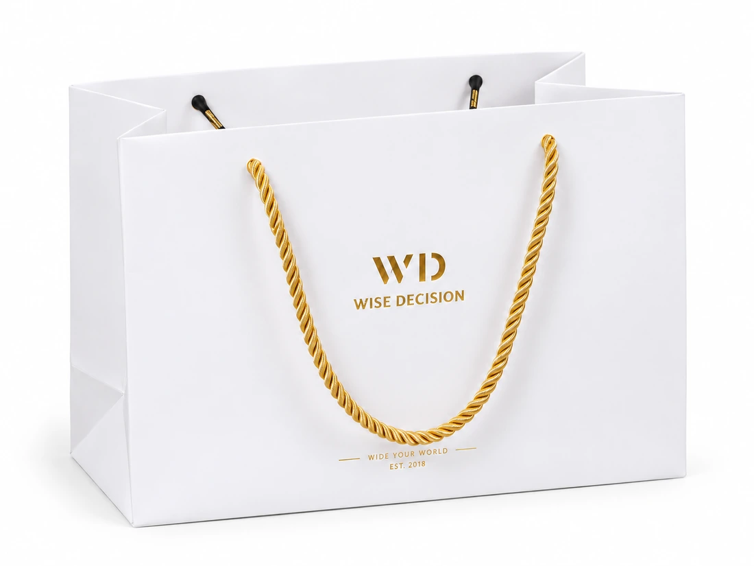
5. Cord handles: a classic jewelry-bag direction
Cord handles give the bag a rounded, defined loop. In the white example, the gold-colored cord echoes the logo and adds detail to an otherwise simple front.
This style works well when you want the handle to remain a visible part of the design without adding a bow. A quieter cord color can soften the contrast, while a more prominent cord makes the upper half of the bag a stronger feature.
Specify the cord's material, diameter, color and attachment when developing the bag. A photograph cannot establish fiber composition, and a thicker-looking cord does not by itself prove that the finished bag carries more weight. For a small jewelry bag, the handle should look balanced with the bag body rather than dominate it.
6. Riveted handles: hardware as a design detail
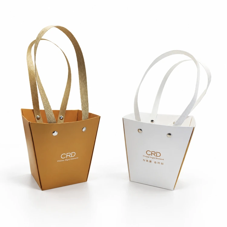
Riveted handles make the fixing points visible. The small round fasteners become part of the visual language, alongside the handle color and the bag's outline.
The gold-toned and white examples have tapered bodies and exposed hardware. Together, those features give them a different character from a conventional rectangular ribbon bag. The rivets can be coordinated with other metallic details, but they need not compete with the logo.
A tapered shape deserves particular attention when choosing the size: the opening may be wider than the usable base. Plan around the jewelry box where it will actually sit. Inside the bag, the fastenings should be finished appropriately so that they do not catch on tissue or rub against the presentation box.
Gold foil and textured paper: where the luxury detail comes from
Gold foil is a common direction for jewelry packaging, especially when the design centers on a small wordmark or monogram. A restrained metallic detail can stand out against burgundy, cream, pink or a muted neutral without covering the whole bag.
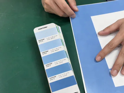
Choose the actual foil shade alongside the paper and handle. Two items described as “gold” may look quite different together. If you want a raised logo as well as a metallic surface, specify that combination separately. Our guide to foil stamping, embossing and spot UV explains the differences. Gold-colored lettering in a photograph alone does not identify its production process.
Textured paper can make a simple layout more distinctive. A fine grain keeps the surface quiet; a more pronounced pattern becomes a visible design feature. Leave enough undecorated space for that texture to be appreciated.
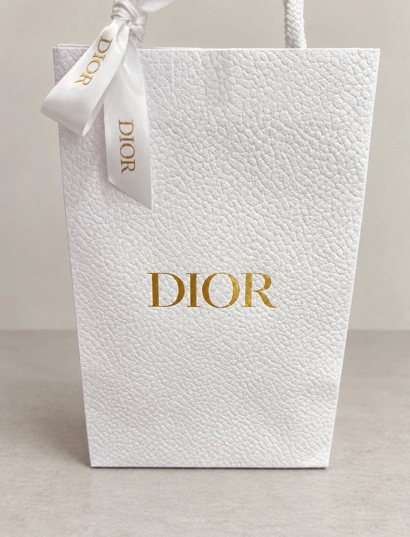
The reference above illustrates a visual idea: strong texture can carry much of the design while the logo stays simple. It is not a specification for every Dior bag or an example of PAQIVA production.
Textured stock can also be foil-decorated, with materials and processing matched to the surface. KURZ describes hot-stamping options for rough and other challenging substrates. For your design, judge the small lettering and foil coverage on the intended paper, not only on a smooth sample card.
Bring the style back to the jewelry box
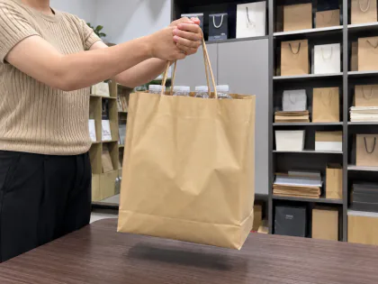
Before choosing a bag size, assemble the complete purchase: the closed jewelry box, outer sleeve, tissue, gift card and any other items that will go inside. The bag should let staff lower the box in neatly and let the customer remove it without forcing the sides apart.
Use front width × side depth × bag-body height when discussing dimensions; handles are excluded. External measurements do not equal usable space inside. Our paper-bag measurement guide shows the three directions.
For a jewelry range with several box sizes, start with the combinations you sell most often. A compact ring-box purchase and a necklace presentation box may call for different proportions even when they share the same paper, ribbon and logo.
Explore paper bags for jewelry and watches, or send PAQIVA your brief with the box dimensions, preferred style, approximate quantity and logo. PAQIVA offers free design support and custom-size blank dielines once the size and structure are confirmed; paper, finishing and sample details can then be developed around the project.