













Coffee Paper Bag Design: Inspiration from Five Familiar Brands
See how five coffee brands use graphic scale, paper color, open space and labels on their bags. Turn these visual references into an original design for your café.

The most useful coffee paper bag inspiration often comes from a clear visual decision: make one symbol large, let the paper color set the mood, or give a small logo plenty of space. A memorable bag does not need to fill every panel with information.
These takeaway carrier examples include Starbucks, Luckin Coffee, MANNER, Tims and % Arabica. Brown paper backgrounds provide the main thread, with two white bags showing how a different background changes the presentation. Look at what catches your eye first, what you read next and what the design leaves empty.
These supplied photographs, edited for presentation, are visual references, not PAQIVA client projects or specifications for every bag used by these brands. The discussion concerns visible color and composition, without identifying paper grades or printing methods from appearance.
Starbucks: let the graphic become the whole front
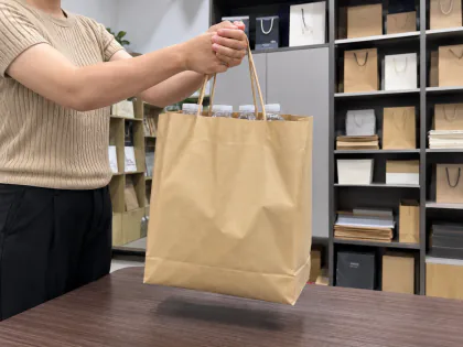
In the cover photograph, the green Siren extends beyond the front panel. It feels more like a large illustration than a small logo placed in the middle of a bag. The face is the focal point; the flowing shapes continue toward the edges and give the design movement.
The brown background is equally important. It shows through the open parts of the artwork, so the paper becomes part of the picture. Green and brown carry the composition without a paragraph of supporting copy on the visible front.
For an independent café, the useful idea is scale. Try enlarging an element from your own identity until it has a stronger presence: an illustration, a distinctive letter or a simple shape. If customers are still getting to know your symbol, keep the café name clearly visible elsewhere in the composition. A large graphic and a readable name can work together.
Luckin Coffee: keep the hierarchy, change the background
The two Luckin bags share a clear reading order. The black wordmark sits above a much larger blue deer graphic, while a small line of Chinese text accompanies the name. The text identifies the brand; the deer gives the lower part of the bag its character.
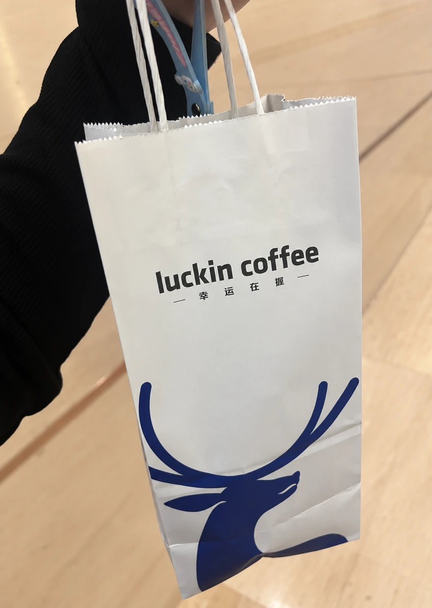
On the white example, the background feels bright and the blue silhouette reads clearly against it. The broad area between the wordmark and the animal keeps the front from feeling crowded, even though the illustration is large.
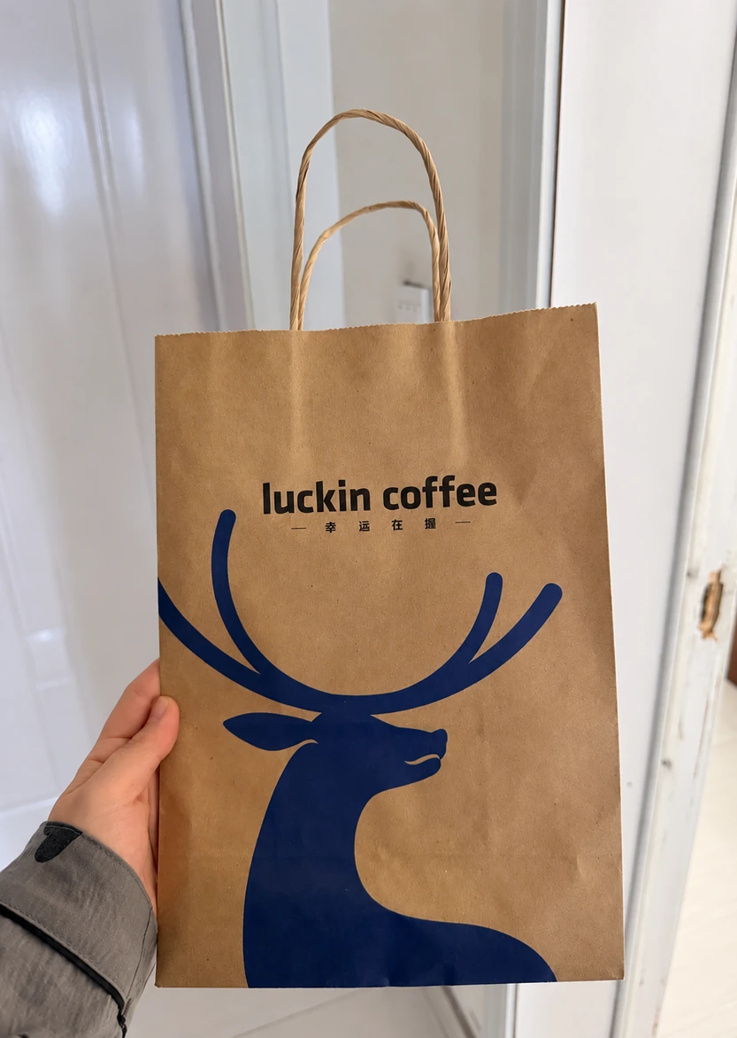
The brown bag has a warmer overall appearance, but the visual identity remains easy to connect with the white version. The useful lesson is consistency through relationships: the name remains above the graphic, and the graphic remains the dominant shape. Every detail does not have to be identical for two bags to feel related.
For your own range, compare layouts on both a brown and a white background before choosing a direction. Treat the paper color as part of the design brief. When that direction moves into production, our CMYK versus Pantone guide explains how to discuss the color specification.
MANNER: give a small mark room, then add one sharp accent
The MANNER bag takes a quieter approach. Its white outlined logo occupies a modest area of the brown front, leaving most of the paper undecorated. The outline has enough separation from the surrounding space to be noticed without becoming a large color block.
The red label at the opening changes the balance. It introduces a vivid accent above the white logo, creating two distinct points of interest along the center of the bag. The result is simple, but it is not just a logo floating on an empty surface.
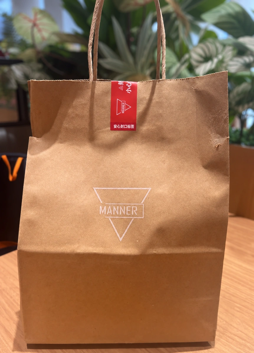
For a café with a restrained identity, a useful direction is to reserve strong color for one small element. A label, seasonal message or narrow band can provide that accent. Plan its position with the main artwork so that it looks intentional when the bag is packed. Here, the top label matters visually because it belongs to the composition as a whole.
Tims: combine the name and symbol into one clear shape
The Tims example uses a red maple leaf with the name appearing in white inside it. The leaf and lettering read as a single badge, surrounded by a generous area of white.
Compared with the cropped Starbucks graphic or the large Luckin deer, this layout keeps the main shape contained. You can see its complete outline, and the clear space around it helps the pointed edges stand out. The flowing script gives the center a softer rhythm than the outer silhouette.
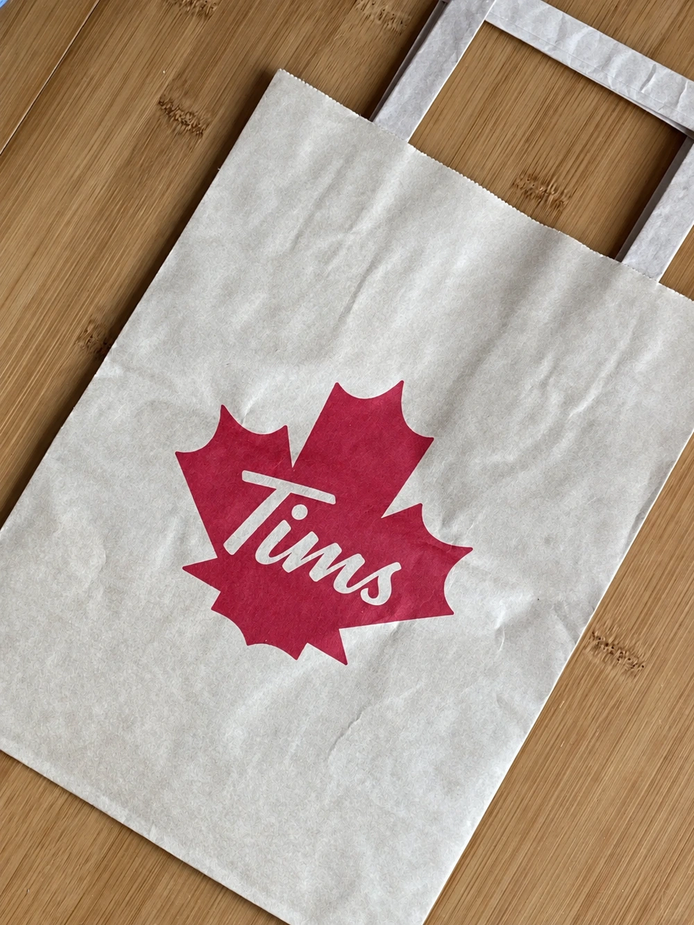
This is a useful reference when your café needs one compact mark that can appear on bags, cups and small labels. Explore a shape that belongs to your own identity and decide how the name sits within it. At a glance, the outline should feel clear; closer up, the lettering should remain easy to read. Adding more decorative elements would change that balance rather than automatically improve it.
% Arabica: give the symbol and name different roles
The % Arabica bag gives the percentage symbol the leading role, with the ARABICA wordmark beneath it. The large black shapes occupy the central area, while the smaller lettering provides a second level of information.
The brown space around the two black elements keeps the composition open. The symbol and the name have distinct roles: one provides a bold shape, while the other tells the reader which brand it represents.
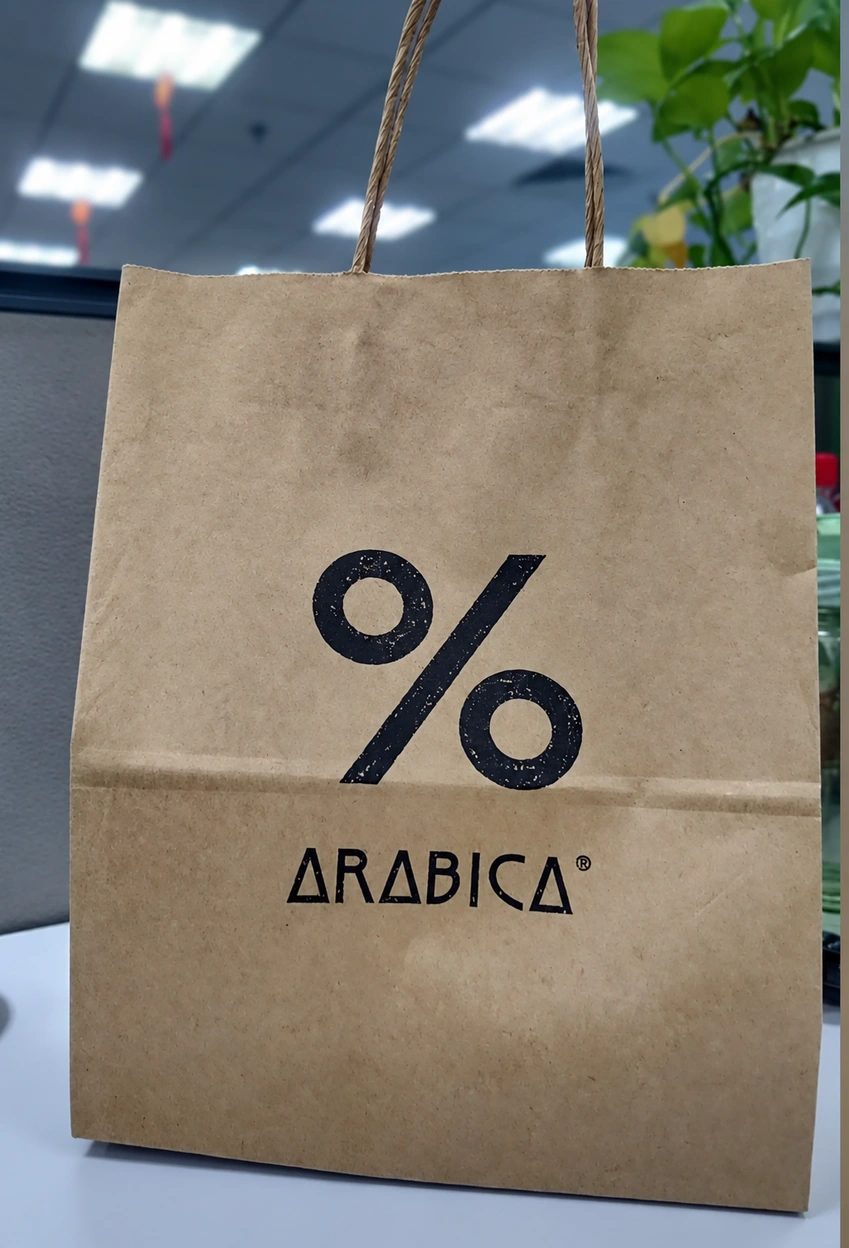
For a café planning its own packaging, the useful question is which part of the shop's identity customers should recognize again on the bag. Your answer might be a symbol, a letterform or a distinctive color arrangement. Give it enough room to lead, then place the name and any practical information where they can be read without competing for the same attention.
Turn the references into a design of your own
Start by choosing the relationship you like most. It might be a graphic that reaches the panel edges, a small mark surrounded by space, or a symbol with a clearly secondary name. Use your own logo, lettering and imagery to develop that idea. Borrowing a layout principle is more useful than reproducing another café's identity.
A simple way to explore is to brief three directions using the same bag outline:
- A bold graphic: enlarge your own illustration or symbol and give the café name a clear supporting position.
- A quiet front: use a compact mark with generous open space, then introduce a small accent through a label or band.
- Two levels of information: let one symbol lead, with the name below it and practical details grouped elsewhere.
Compare the three layouts, then try the strongest version on brown and white backgrounds. This keeps the exploration focused on the relationships that made the reference interesting in the first place.
Look at the designs as small thumbnails as well as at full size. The small view makes the main shape apparent; the larger view shows whether the name, spacing and finer details work together. If a label will be added at the counter, include it in the layout from the start.
For another example beyond coffee, our UNIQLO kraft paper bag breakdown looks at simple retail branding on a brown background. When your direction is ready, the paper bag artwork guide explains how to prepare the logo and design files.
Explore PAQIVA's paper bags for coffee shops and cafés, or share your design idea with your logo, preferred paper color, approximate bag size and quantity. PAQIVA offers free design support and, once the size and structure are confirmed, free custom-size blank dielines to help develop the idea into your own bag.